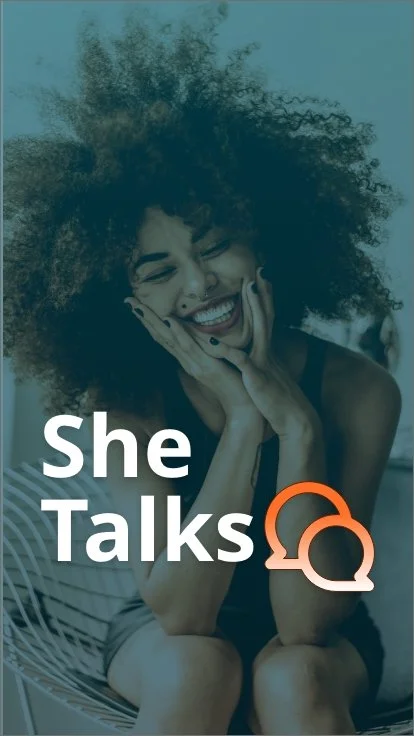
Why SheTalks?
As a young woman, I have unfortunately had several experiences where medical professionals have dismissed my concerns regarding my health. Unfortunately, I am not the only women who have experienced this. For this reason, I created SheTalks, a medical application where women's/girls’ health is our main priority and where they can feel safe and accepted.
UX/UI Designer
UX Researcher
My Role:
Duration:
Sep 21 - Jun 15
Tools:
Adobe XD.
Optimal Workshop
Miro
Figma
Google Survey.
Google form
Objective:
SheTalks is an all-women health support application. Women can receive medical help or advice at any given time. Either through the use of our doctors, community, or our blog page. SheTalks is here to provide the medical support that women deserve.
DESIGN PROCESS:
Competitive AnalysisUX Researcher
User Research
01 Discover
User Persona
User Journey
02 Define
Site map
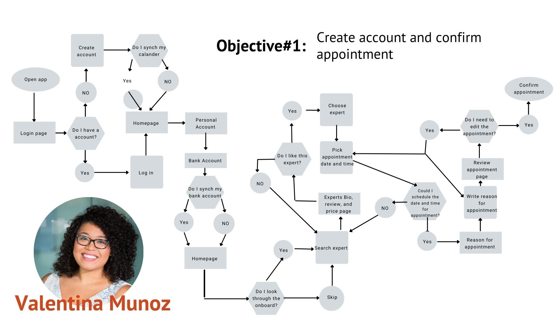
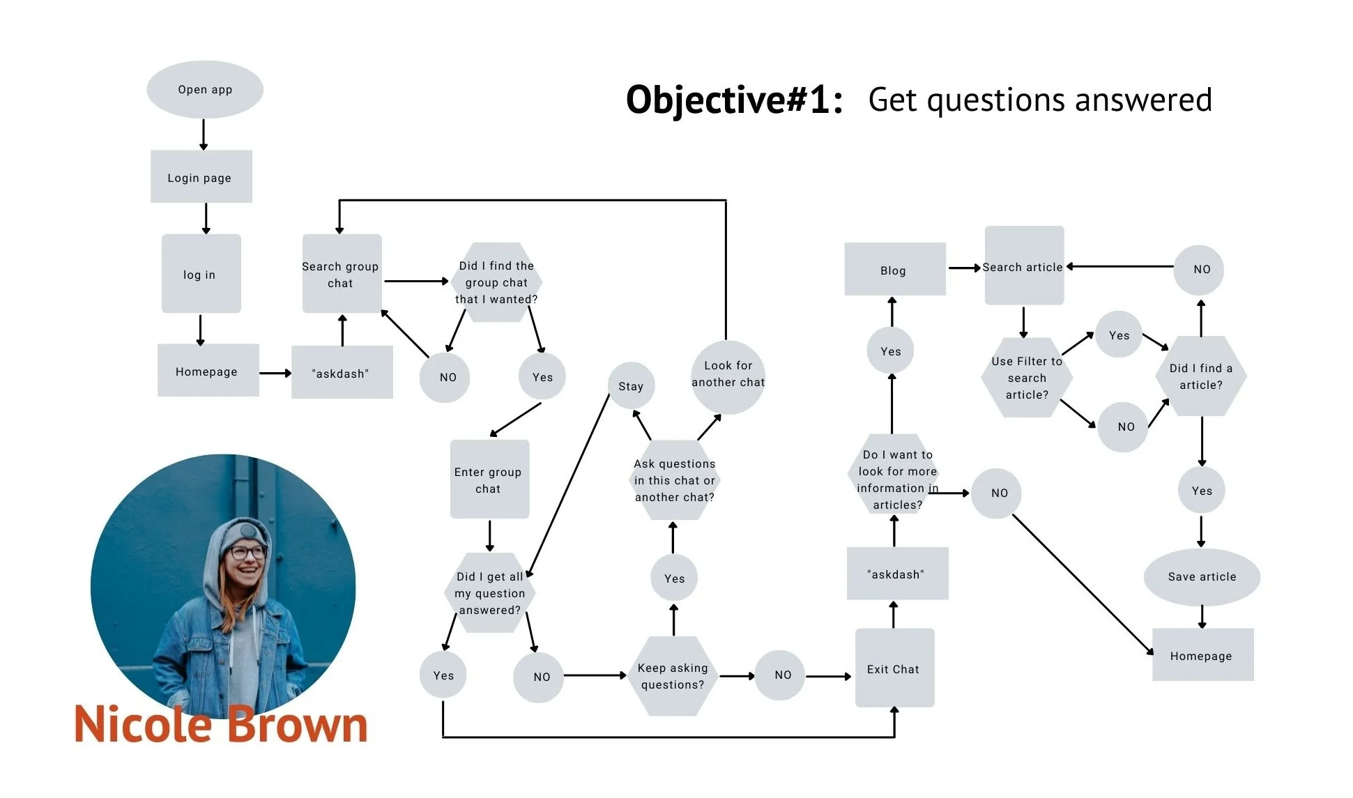
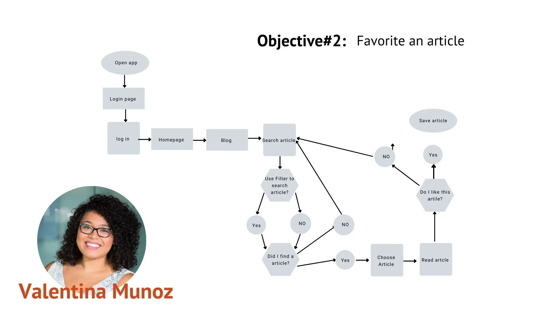
User Flow
Card Sorting
03 Ideate
Wireframing
Prototyping
04 Design
Feedback
05 Test
01 DESIGN PROCESS:
Competitive Analysis & User Research
Our focus is to create a health-related platform for women. To get started, I conducted a competitive analysis on two different applications: She’s Well & Your doctor. Creating this analysis helps me understand my opponents, what works for them as a business, what doesn't, and what achievements they are trying to reach. Understanding my competitors will help me uplift my app by providing services that my competitors lack.
Key objective: YourDoctor is an application to receive quick and easy access to medical help/advice. “No more waiting rooms and no more scheduling- get a real-time connection to our team of 150+ board-certified doctors for a convenient online chat with a doctor.”
YourDoctor:

She’s Well
Key Objective: She’s Well is an app to help women with their health and fertility. Its main focus is to help women through their fertility, it can also be a guide for all women who want to be mentally and physically healthy.
An opportunity for us is that our targeted audience is women’s health. When looking for competitors, barely any apps focused on women’s health. She’s well is one of the few applications that focus on women’s health, but even then, they don’t have reliable communication with a health professional. Our competitors lack safe spaces for women to feel included when promoting their healthcare or providing reliable communication. Being trustworthy, quick, and on-demand 24/7 is what these apps are missing, which is what SheTalks will provide.
Opportunities:
Quantitative and Qualitative Research:
Next, I interviewed five potential users and posted a survey on Careerfoundry’s slack task channel to understand what kind of medical services women would like to receive when reaching out for help.
Research Goal:
Understanding what my users will first do when facing health issues.
What makes them comfortable or uncomfortable when talking to an expert
What are certain aspects that the users like and dislike about our competitors?
Interview and Survey summary:
Few women turn to doctors due to a lack of security, trust, effectiveness, slow responses, and comfort.
The patients would rather talk in person instead of online
The patients would instead look for information online, even if it's not reliable, instead of going to an expert
They feel comfortable talking about women’s health
Instead of going to an expert, they go to their loved ones
Possible solutions:
Present evidence that our health experts are reliable and hard workers. We would do this by showing information about the experts and rating them by past clients.
Provide information and directions to nearby clinics that patients can go to
Provide video calls to communicate with the expert. That way, the patient can see the expert.
Have the patient make an appointment with the expert for a quick response and provide a blog with reliable and updated information.
Create a community where women can join different group chats to inform women about women's health and share personal experiences.
Provide a guideline that experts and users will be respectful in the community chat and appointments
02 DEFINE
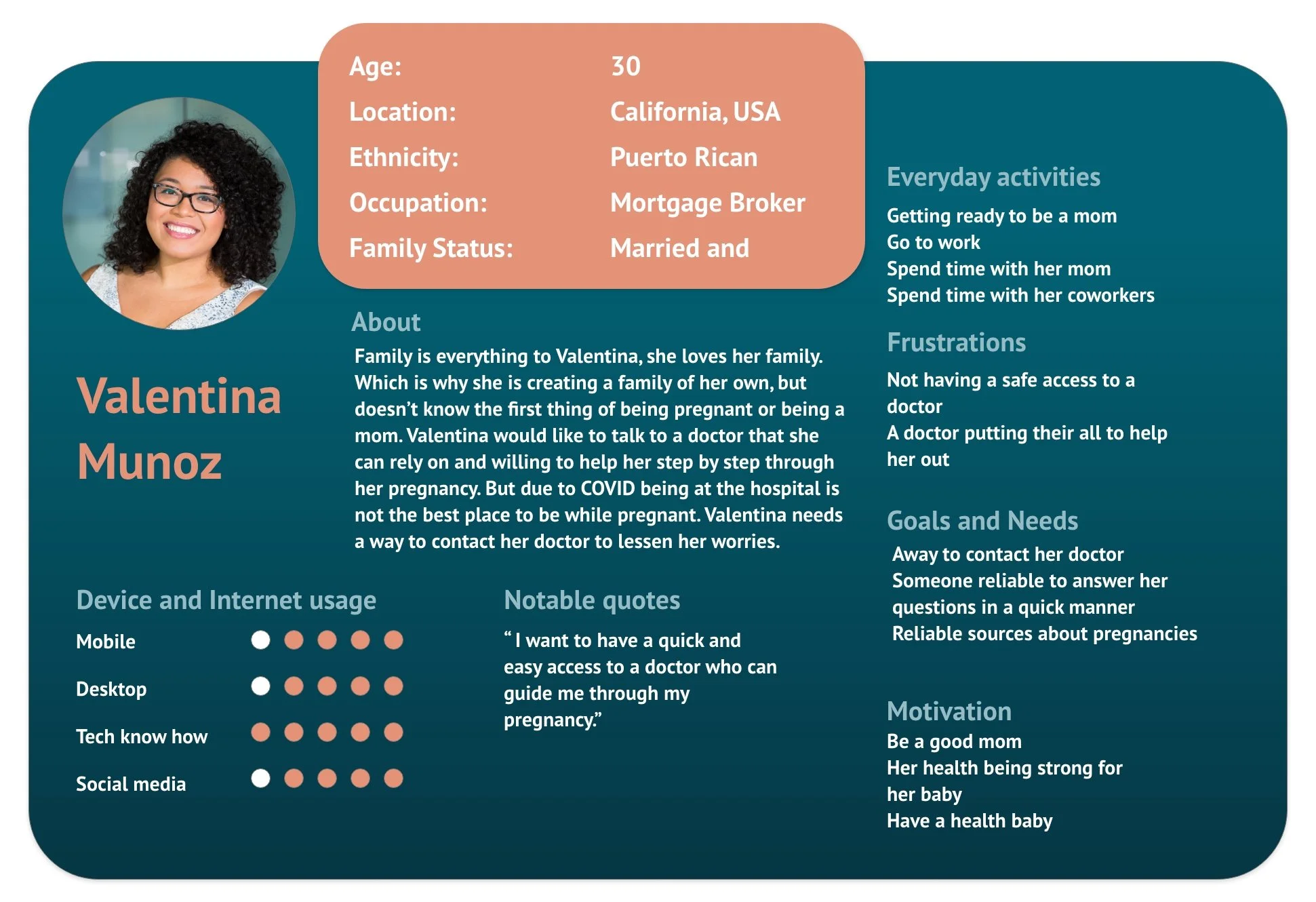
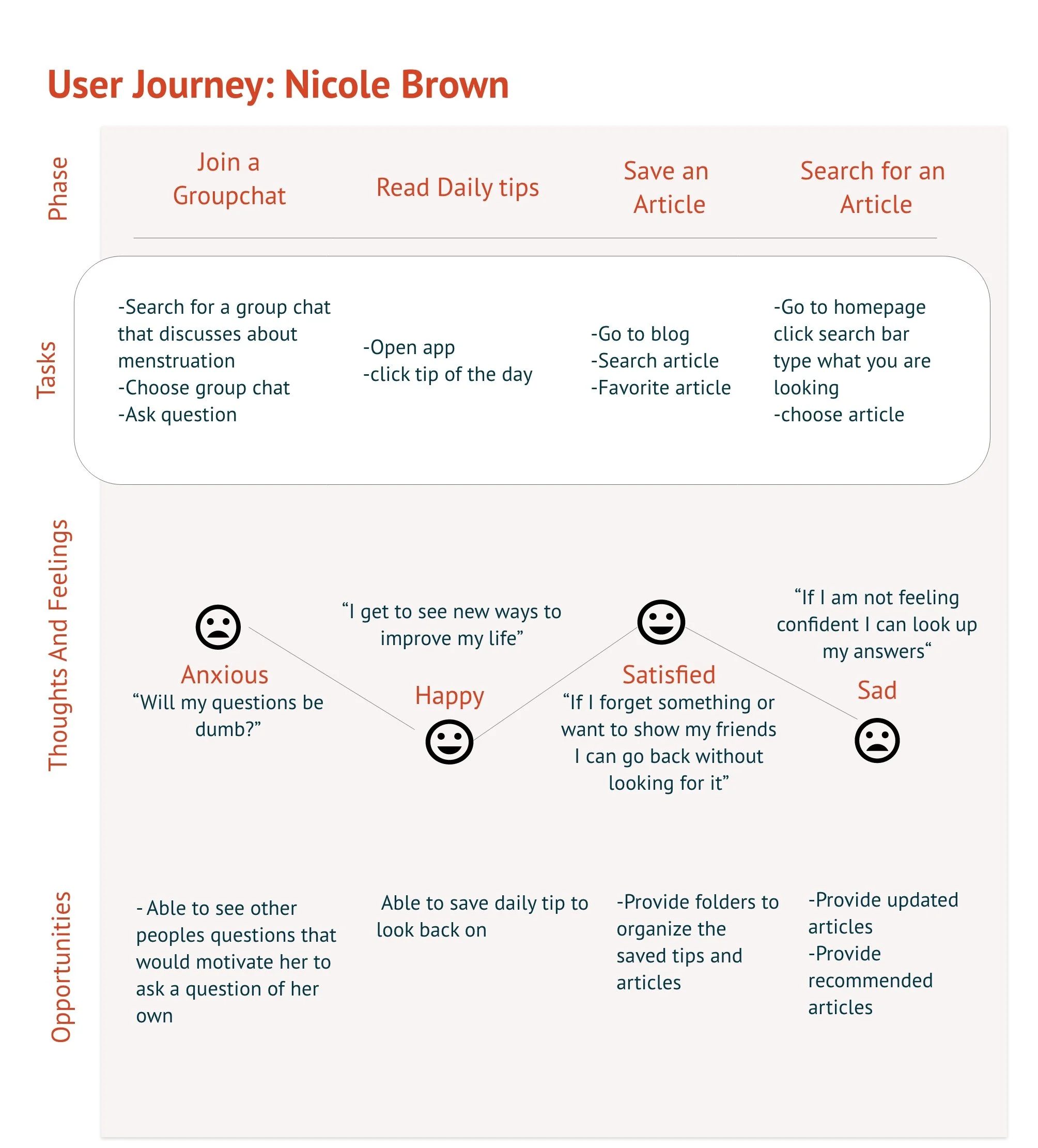
User persona and User Journey:
After collecting all the data from the quantitative and qualitative research, with that information, I was able to create two user personas. These two ladies are the representatives of my targeted audience, and with their help, I can focus on my audience’s needs for this project
User Persona:
User Journey:

User Flow:
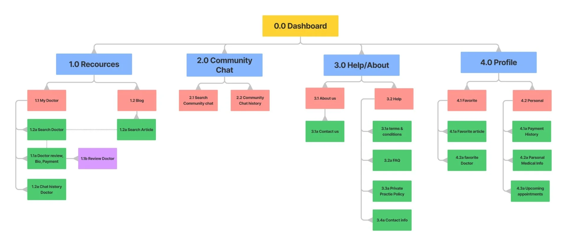
Sitemap/ Card sort:

03 IDEATE
User Flow and Sitemap:
I had to create a card sort with Optimal workshop to create the sitemap. I had nine people overall, and they took on average 3 minutes and 38sec to complete the study. With the card sort results, I created the sitemap below.
Low- Fidelitiy
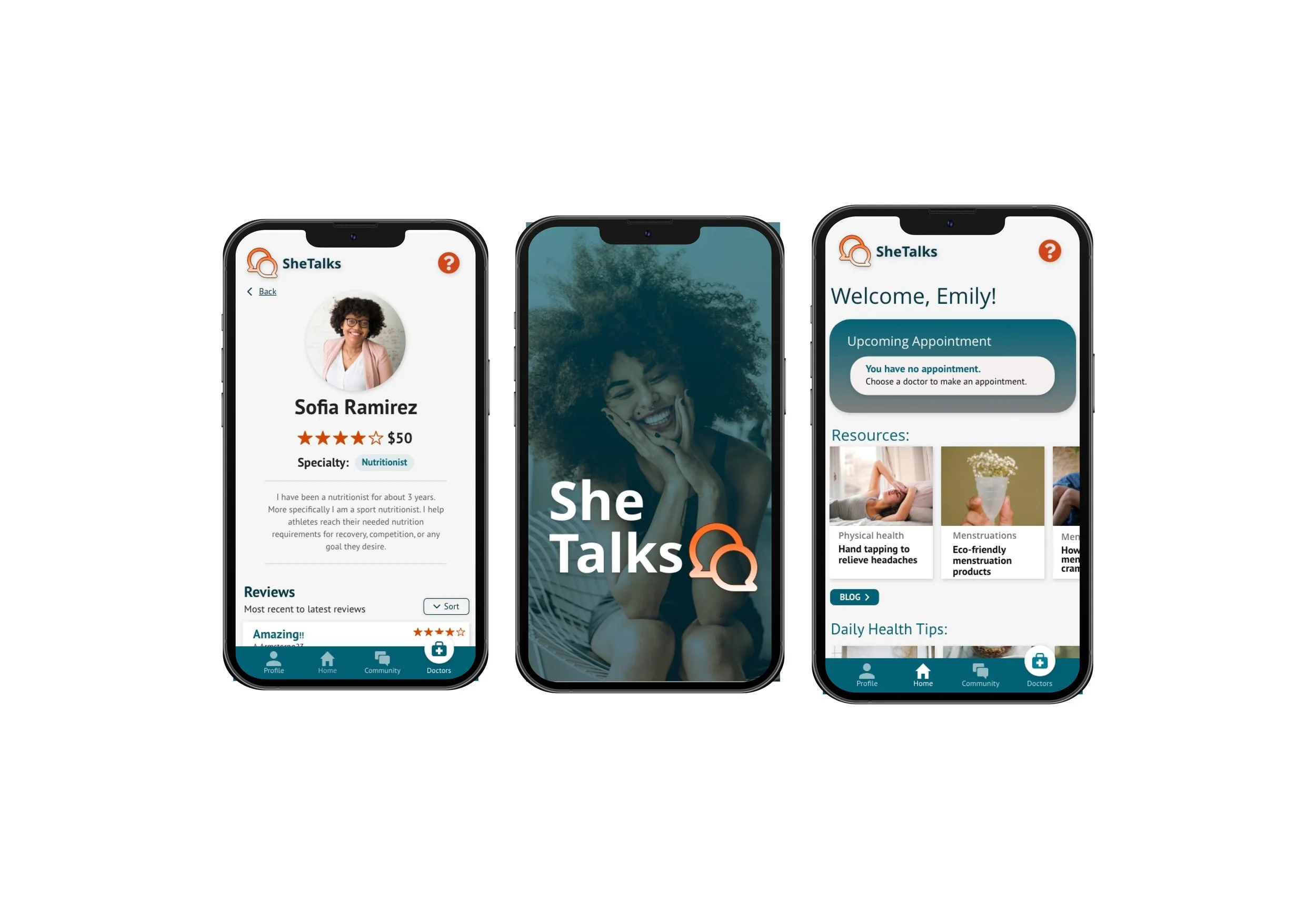
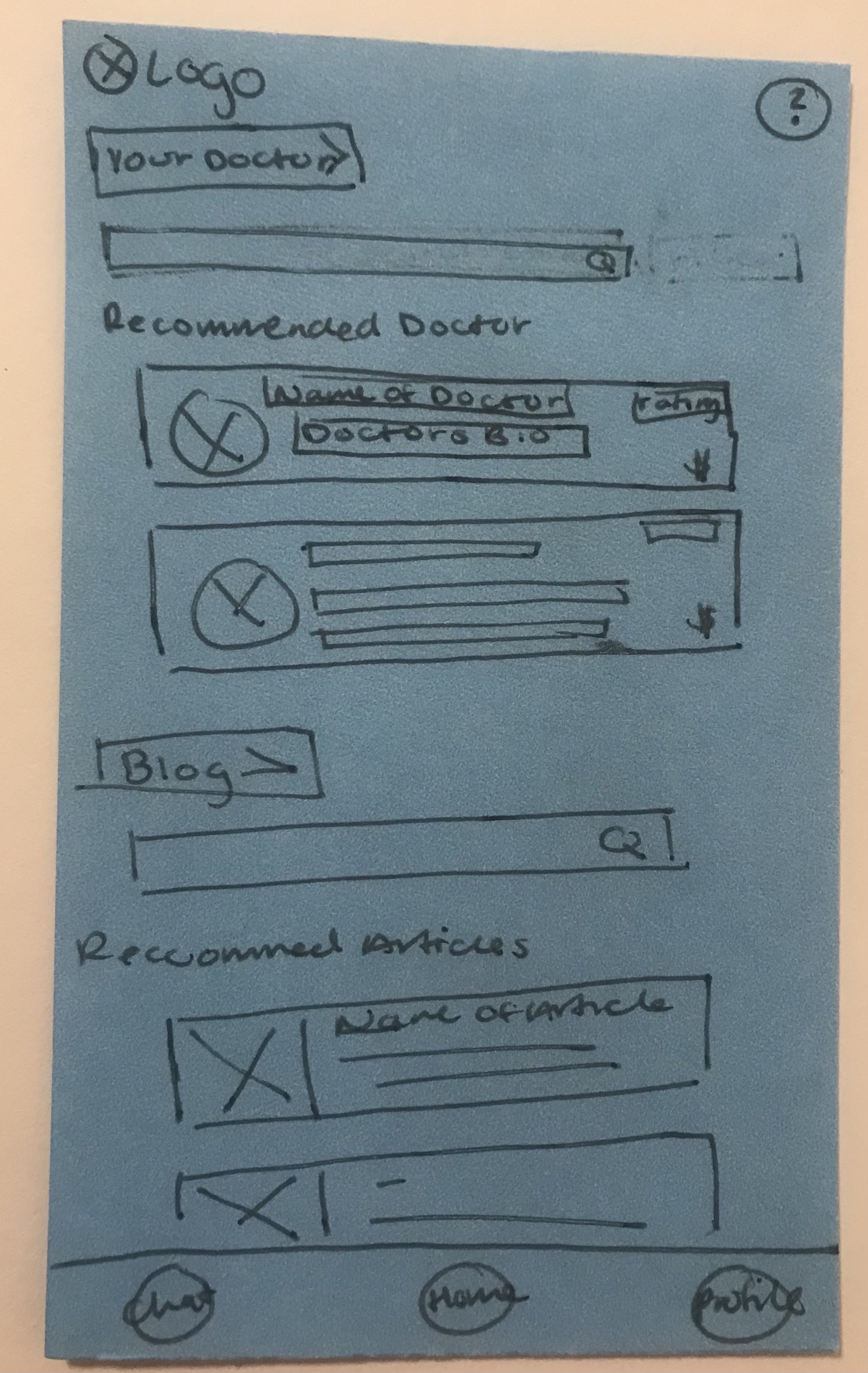
Homepage
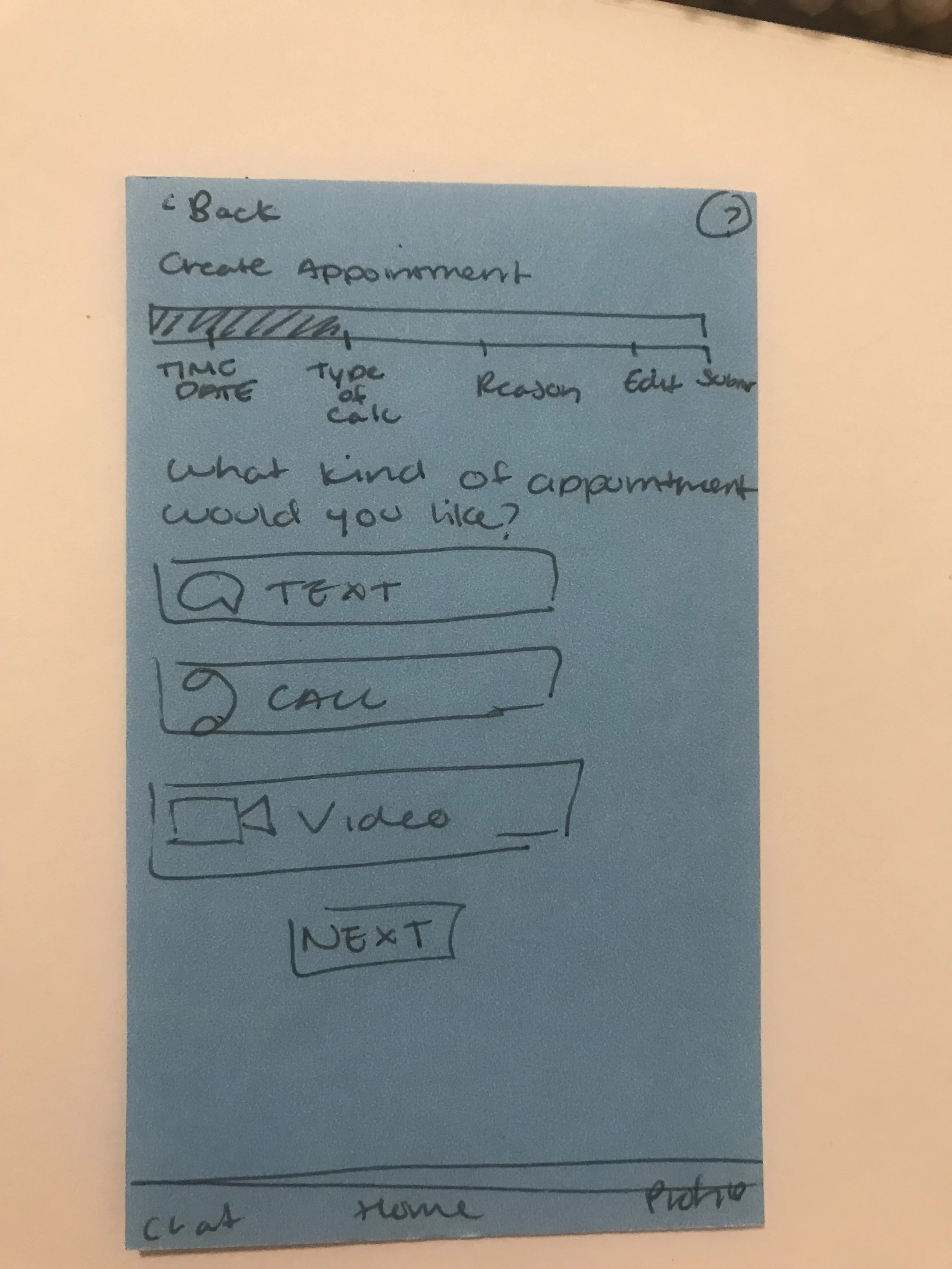
Type of appointment
04 Design
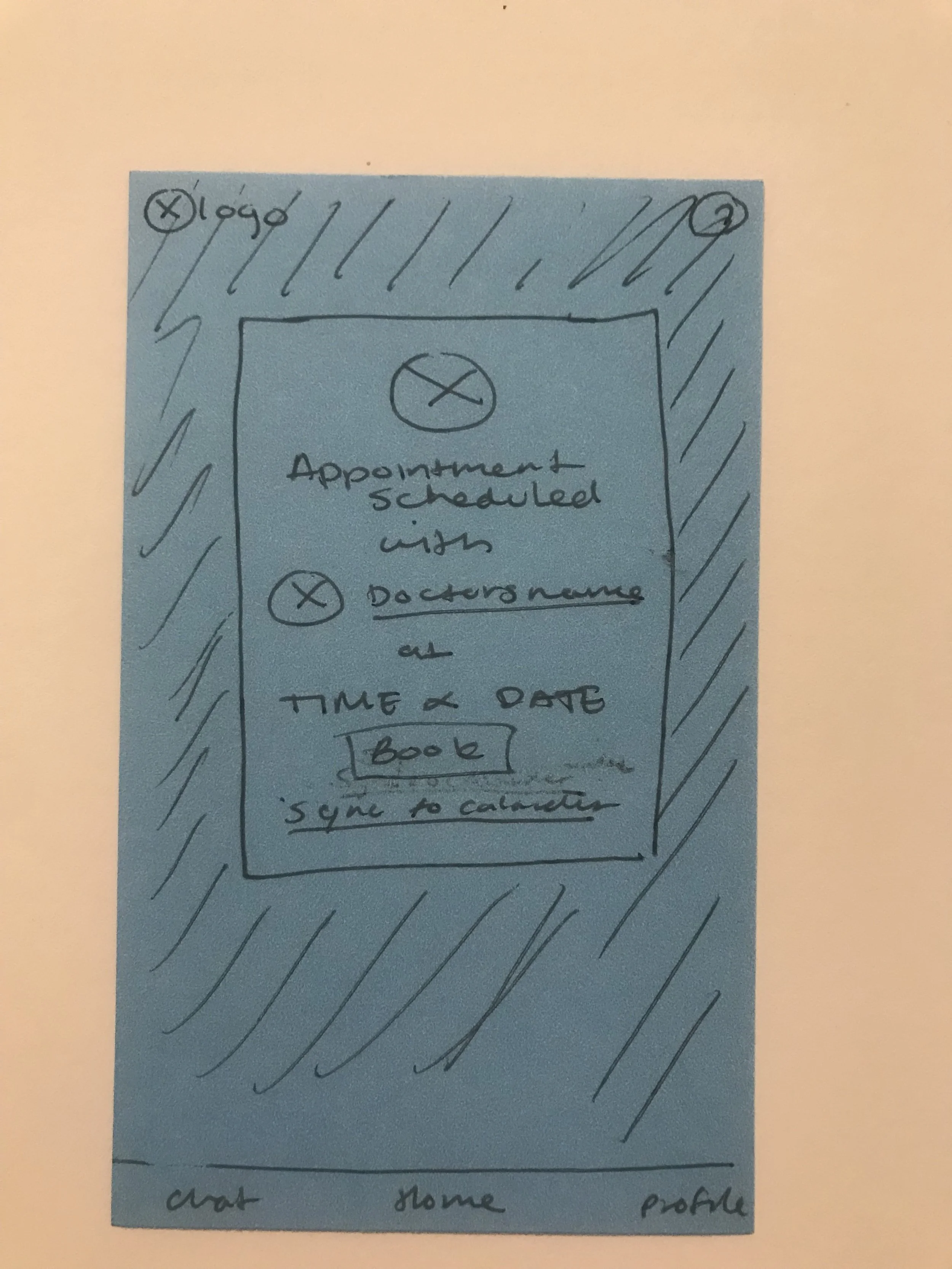
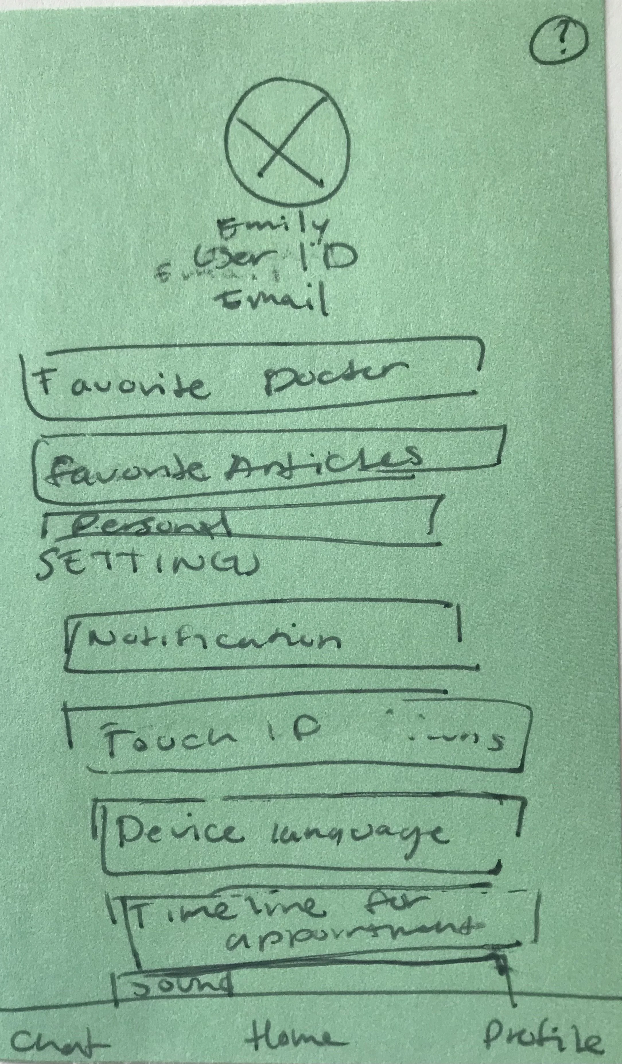
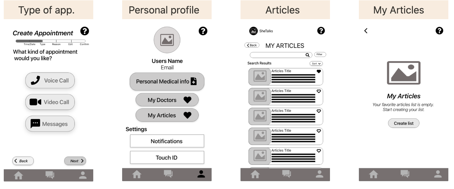
Wireframing
After collecting information about my competitors and creating the user personas, journeys, and sitemap, the next step was to start wire-framing.

Doctors information
Appointment confirmation
Mid-Fidelity:

Reason for appointment
Resource page

Personal information
Calendar


05 Test:
Feedback, Redesign, Polish & Prototype
After completing the mid-fidelity of SheTalks, I tested the design. I had six women from different age groups test the design. Their feedback helped me focus on the UI hierarchy and resource page. There was much confusion about the resource page/ After testing, I gathered all feedback and separated them into different categories creating an affinity map. The affinity map helps me focus on what needs to change in the design for the better.
Feedback:

Affinity Mapping:


After redesigning SheTalks, I went back one last time and did a final polish on the UI. During this final polish, I thought about accessibility. I went back to improve the color contrast and adjusted some buttons for those with mobile impairment. I also added icons to help those with visual impairment.


Final Polish:
1.) I changed the colors of the icons, password/username buttons, and text labels by adding tints. Improving the color contrast brought the WCAG from A to AA.
2.) Starting with the search bar, I added a text label to the search bar. That way, the user doesn't forget what they are typing. Next, I changed to color contrast on the disabled chat history to better visualize the button’s text. I also changed the navigation bar.
3.) I lowered the doctor’s button; that way, those with mobility difficulties can have an easier time and not accidentally click on the sorts buttons. I also changed the text of the doctor’s name. I changed the color and sizing of the text. The color contrast brought it from AA to AAA. Besides changing the size, the users can focus on the name and easily remember it.
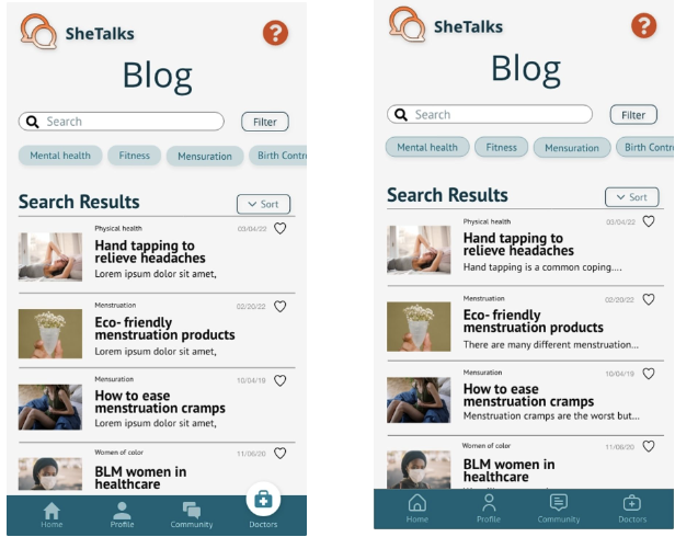
4.) I added a border to the chip for better contrast. I also added a hearing icon so the user can listen to the article. Adding the hearing icon will help those who are visually impaired. I also added an image description so that when the user listens to the report, they hear the image’s caption.
5.) added a border to the chips along with the last slide to better contrast the background and the chips.
6.) I changed the color of the available times, which brought the WCAG from AA to AAA. Doing so will help those with colorblindness to identify the available dates. I also boarded the chips since the contrast between the chips and the background blended. Doing this brought the WCAG from an A to a AA.